

What is this?
The recent inauguration of Regional Connector has drawn my attention to Los Angeles, and I've realized that I don't really like LA Metro's current official map. In my reworking, I've attempted to convey more information in a square format without compromising legibility. I'm not sure whether I've successfully created a better map, but I figure it's different enough to publish regardless.

Grid adherence
Los Angeles is a city defined by its street grid (if less so than, say, Chicago or Manhattan). The Metro system reflects this, in the shape of its bus network and the nomenclature of its rail stations. I'm typically one to favour legibility over geography in transit diagrams; however, given this context, it's puzzling to me that the official map makes little attempt to adhere to the grid. Note in particular the simplified alignments of the B and K lines and how they affect relative station placement.
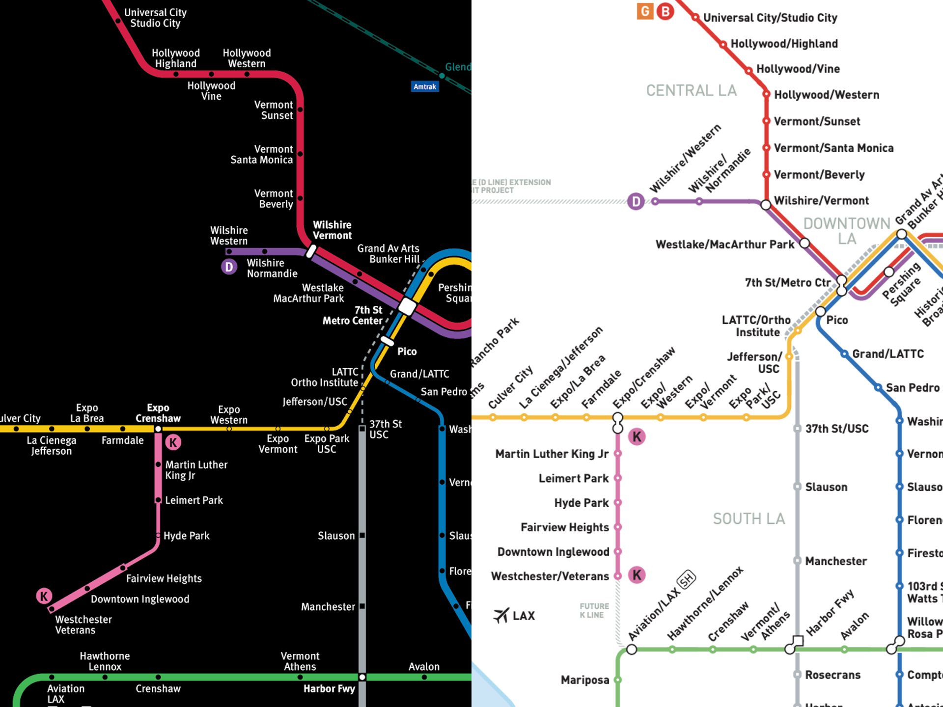
New information
My map shows some information that is omitted from the official map. I've added a thinner route line style to denote sections of LRT which run in the street. Thankfully, trains do operate in dedicated lanes, but on-street service is generally slower and often interrupted by traffic signals. (Crossing gates and full priority when?) I've also drawn Metrolink lines and stations within Metro's service area, rather than simply indicating their limited connections to the Rail and Busway network.
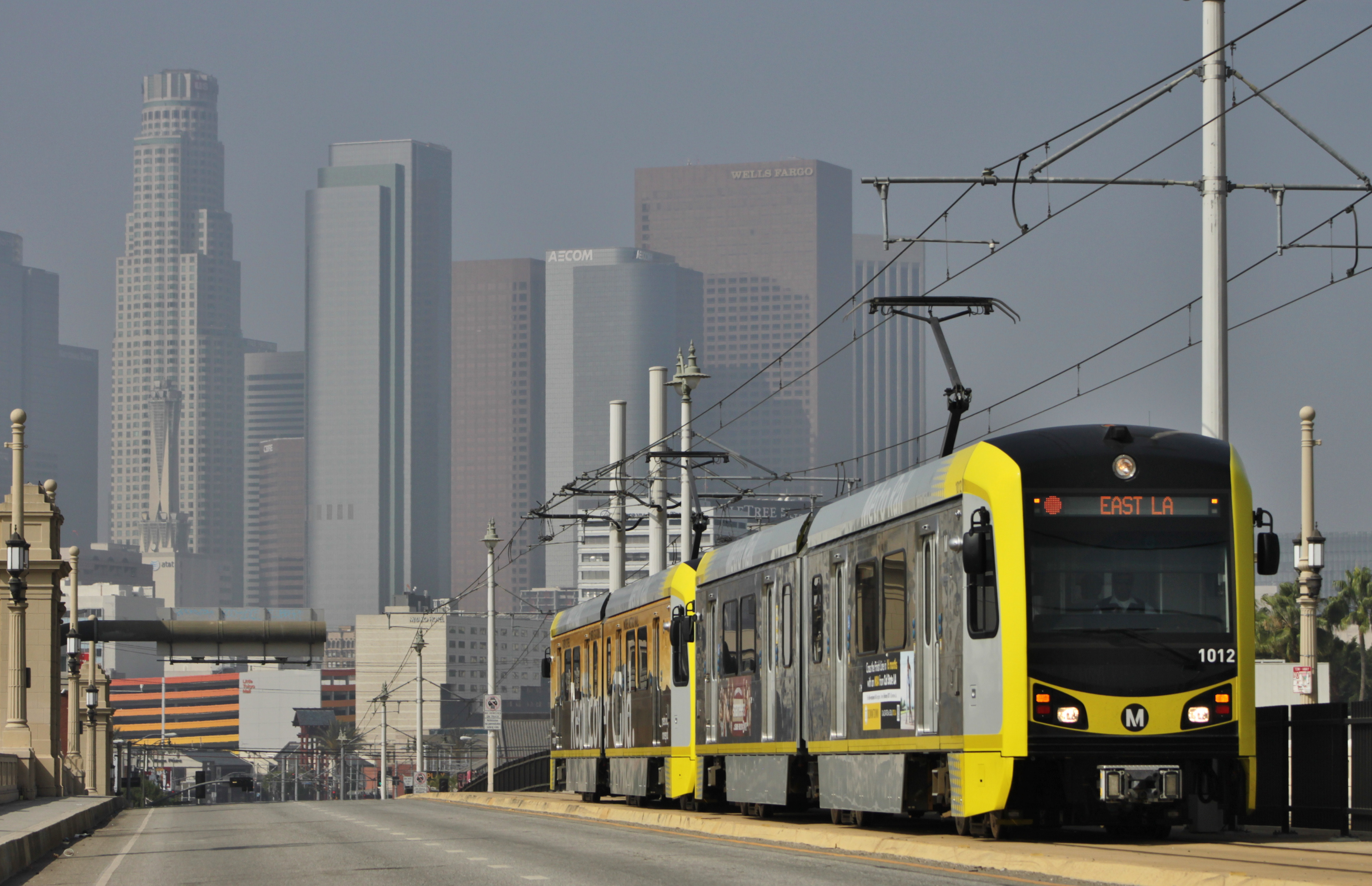
LA Metro Rail operating on-street | CC BY-SA 2.0 SounderBruce
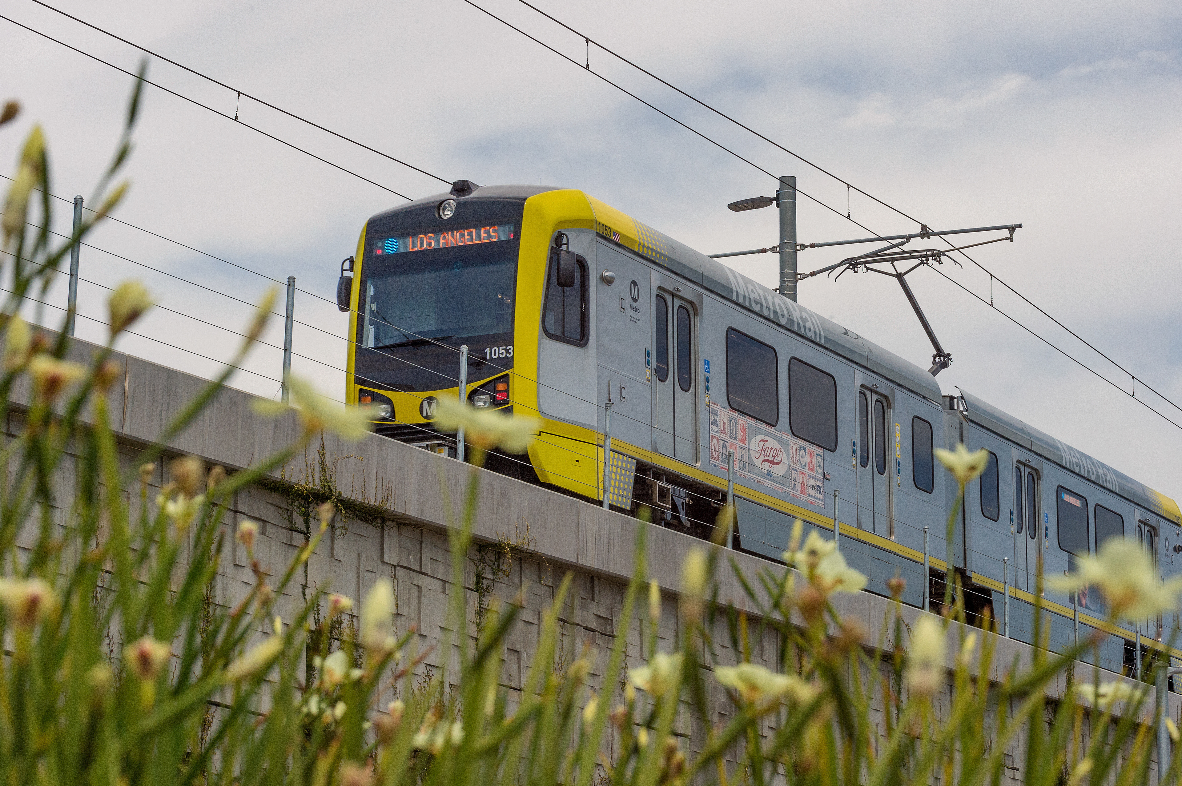
LA Metro Rail operating above grade
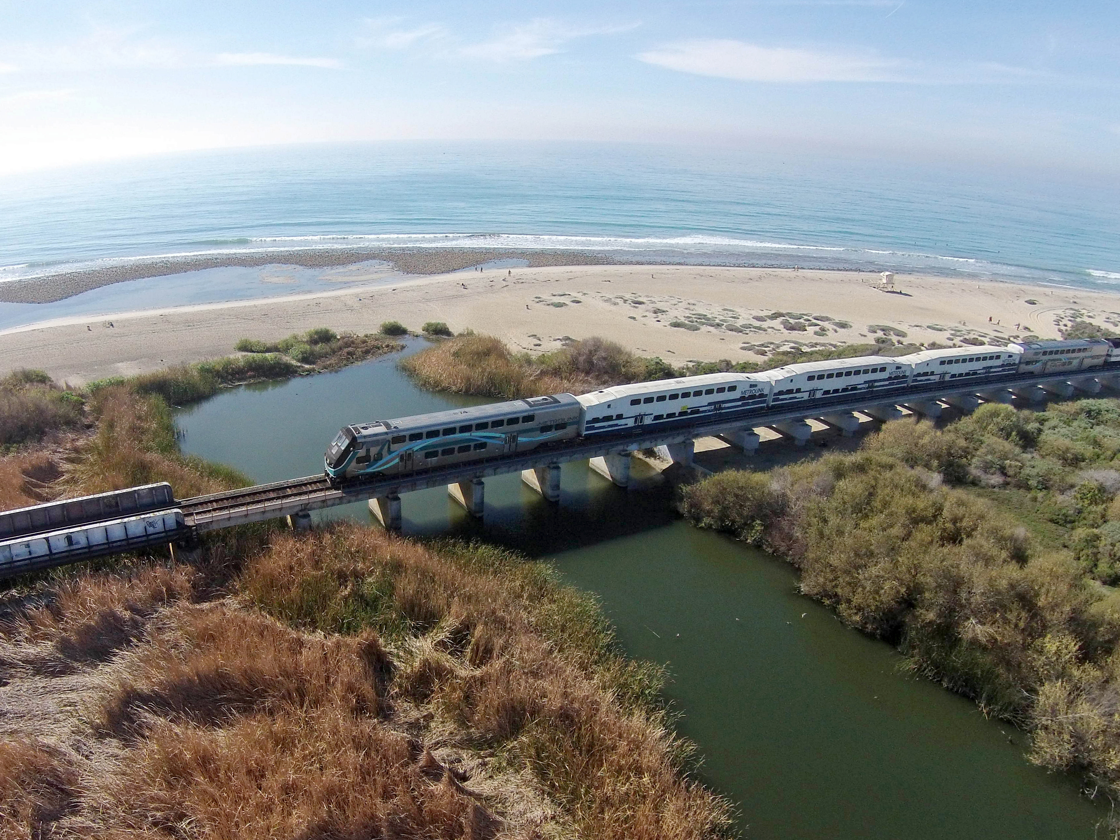
Metrolink commuter train | CC BY-SA 4.0 Andrewaronoshn
Other style notes
I've taken the liberty to improve upon the official map through my usual style, rather than trying to adapt Metro's visual language. I can't guarantee that anyone will prefer my finished product to the real deal as this largely amounts to personal preference. Here are some design choices that distinguish my map from theirs:
30-degree angle increments reduce squiggles necessary to align route lines to the grid, more closely matching the shape of Los Angeles
Regional Connector is deliberately integrated into the central area's geometry
Station labels set horizontally to improve legibility
Dark background, for the vibes