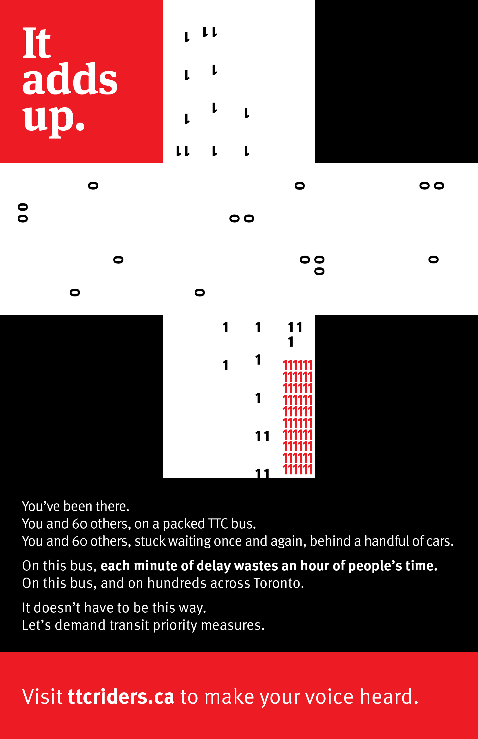

The first assignment in my Typography course was to create a tabloid-size poster calling attention to a social cause using only type and very basic shapes. I opted to create a poster about the lack of transit signal priority in Toronto, calling on the viewer to get involved with a transit advocacy group. It abstractly depicts an intersection, using numerals to represent vehicle passengers, with values representing minutes spent waiting. The intersection itself suggests the shape of a plus sign, making reference to the title: "It adds up".
This is my first work in Adobe InDesign. Per assignment instructions, it was also exported to PDF files for print and digital output.
Not associated with TTCriders